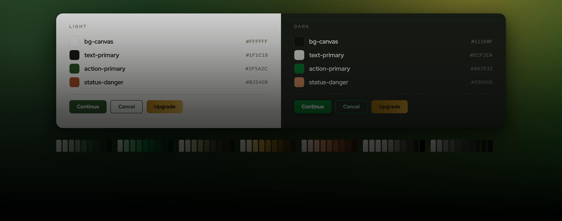
Giddaa's Design System
Giddaa's design foundation rebuilt as two layers: 37 semantic names that resolve both Light and Dark, Over 100 theme responsive components.
About the Project
Building the Giddaa Design System
Where it started
Giddaa is a property and mortgage platform, and by the time I started this, its interface had grown faster than its vocabulary. Colours were being chosen per screen. The same grey answered to three or four different names depending on which file you opened. And the dark theme we wanted would have meant repainting every surface by hand, because nothing in the product pointed at a shared definition of anything.
So the job wasn't really "design a component library." It was: give the product a vocabulary first, then build components that can only speak it.
Two layers, not one
The obvious move is to build a nice palette and start using it. I didn't, because a flat palette can't do dark mode. It can only do a second flat palette, and then you own two of everything forever.
Instead I built the system in two layers.
The first layer is primitives: 66 raw colour values in numbered scales. Forest and Emerald for brand, Moss, Yellow and Red Clay for support, and two separate neutral ramps. These are locked. Nothing in the product consumes them directly, and only the system maintainer touches them.
The second layer is 37 semantic tokens named for intent rather than appearance — bg-canvas, text-primary, action-primary, border-focus. Each one aliases a primitive, and each one carries two modes. So a single name resolves to a Forest green in Light and an Emerald green in Dark: 37 names, 74 resolved values.
The split sounds bureaucratic until you try to change the brand green. With one layer, that's find-and-replace across every file and a week of missed instances. With two, it's one edit to a primitive — every semantic aliased to it moves, and every component bound to those semantics moves with it.
Naming for the handoff, not for the picker
Two naming rules did most of the work here.
The first: name for intent, never for appearance. bg-canvas, not white. action-danger, not red-500. Appearance-based names are lies waiting to happen — the moment a "white" surface becomes near-black in dark mode, the name is actively working against the person reading it.
The second rule is the one I'd defend hardest: the leaf name a designer picks in Figma is the identifier a developer types in code. A designer opens the variable picker and chooses text-primary. A developer writes text-primary. There's no mapping table, no translation step, and no conversation about which grey was meant. It costs nothing to set up and it deletes an entire category of handoff friction.
Dark mode isn't "darker"
The naive version of a dark theme darkens everything by some amount. That produces mud.
The brand actually changes family between modes: Forest in light, Emerald in dark, because the Forest greens that read as confident on white read as sludge on near-black. Neutrals get their own dedicated ramp too — Stone for light, Stone Dark for dark — rather than inverting one scale, for the same reason.
Modes are set on top-level frames through Figma's setExplicitVariableModeForCollection, so one file can show both themes side by side and every semantic-bound element re-resolves on its own. That's what makes reviewing dark mode possible at all: you see both at once instead of toggling and trying to remember what the other one looked like.
The parts variables can't hold
Not everything fits in a variable, and pretending otherwise is how systems develop quiet holes.
Gradients
Figma variables don't support them. So the 16 gradients live as Color Styles with --light and --dark suffixes, and there's no automatic mode swap — you pick the right one for the surface you're on. That's a real limitation, so I documented it rather than hiding it.
Elevation
Six effect styles. Light mode uses shadow stacks the normal way. Dark mode mostly doesn't: it lifts tonally, giving each level a lighter background instead, and only applies a shadow at the top two levels. A drop shadow on a near-black surface does approximately nothing, so spending elevation on it is wasted.
Type
44 Red Hat Display text styles, always applied as styles, never as inline font sizes. Inline sizes look identical on the day you set them and drift permanently afterward, because there's nothing central left to refactor.
Altogether: 123 distinct tokens and styles.
The component that made me write code
Then components, built as Component Sets with the theme baked into each variant.
Button is where the approach had to change. The matrix is sizes × types × states × icon-or-no-icon × theme, and it comes out at 1,280 variants. There is no version of that I draw by hand, and more to the point, no version I maintain by hand.
So I built it in code, driving the Figma Plugin API through an MCP connection. Each variant gets created, auto-laid-out, and has every fill and stroke bound to a semantic variable programmatically. Each one also pins its own mode to the semantic collection — which matters more than it sounds. Without that pin, a Theme=Dark instance dropped into a light-bound frame silently re-resolves to light. With it, dark stays dark wherever it lands.
ButtonGroup followed at 24 variants, then Dropdown.
What went wrong
The generation approach worked, but not on the first attempt, and the failures were consistent enough to be worth writing down.
The 125-second wall
Any call that scanned the file blew straight past the MCP timeout. The fix wasn't optimisation, it was refusing to scan at all: work from explicit node IDs, and when I don't have one, ask for the link rather than searching for it.
The cascading write
Writing a fill to a single variant whose colour is bound to a heavily-used token cascades through every node in the file using that variable. One variant, one property, and it still times out. So: check the existing bindings before writing, and when the target is a top-level token, do it through the Figma UI instead.
Cross-page reads wedging the runtime
Fetching a node that lives on another page triggers a synchronous load of that entire page, which in a file this size regularly exceeded the timeout. Worse, the failure doesn't actually stop the plugin, so every call after it hangs too. The fix was to stop reading foreign nodes entirely: harvest each dependency component's published key once in a short read-only pass, then import by key during the build. That's a cached server fetch measured in milliseconds, and it never loads a page.
No state between calls
Nothing persists across plugin invocations, so every call has to return the IDs of what it created. Otherwise the next call can't find its own work without doing the one thing that isn't allowed — scanning.
What the token sync surfaced
A second set of problems, all of them the same shape:
• Stuttering folder paths like Backgrounds/Surfaces/Background/Surfaces/Surfaces/bg-canvas, from careless variable naming, producing a five-deep tree in the picker.
• Case-toggled duplicate folders, because Text and Foreground/ and text and foreground/ are two different folders as far as Figma is concerned.
• Double spaces inside variable names, creating entries that look identical and match different code keys.
• A duplicate hex inside a scale, which is almost always a copy-paste typo. It was — one stop had been pasted over another.
• Semantics aliased to primitives that didn't exist yet. These don't error. They silently fall back to a raw colour and lose mode-swapping, so the fix is ordering: all primitives first, then semantics.
• Frames pasted in from another file keeping their bindings to the source file's variables, which have to be audited and rebound.
None of these are interesting on their own. Together they're most of the reason design systems rot, because every single one produces something that looks correct and behaves wrong.
Documentation is part of the component
A component isn't done when it renders. Each one ships with two documentation frames, Light and Dark, each bound to its mode: anatomy, the full size, type and state matrices, do-and-don't cards, and a token reference table naming the exact variable behind every slot. The whole thing sits in a wrapper with a Base/Default preview card, so the canonical instance is obvious without hunting through the grid.
The both-modes rule is the important one. A component documented in a single mode has half its behaviour invisible, and the invisible half is exactly where it breaks.
.
Making it repeatable
The last piece was writing the process down: gathering links up front, the binding patterns, mode pinning, documentation layout, and every one of the defensive rules above. The next component starts from that recipe instead of a blank frame, and doesn't get to rediscover the 125-second wall on its own time.
Where it stands
123 tokens and styles. 37 semantic names covering both themes from one vocabulary. Over 100 Components that carry their theme with them and document themselves in both modes. A dark theme that's a mode binding rather than a second design.
The measure of it isn't the component count, though. It's that changing the brand green is now one simple edit.
Tools Used
 Figma
Figma Claude Code